
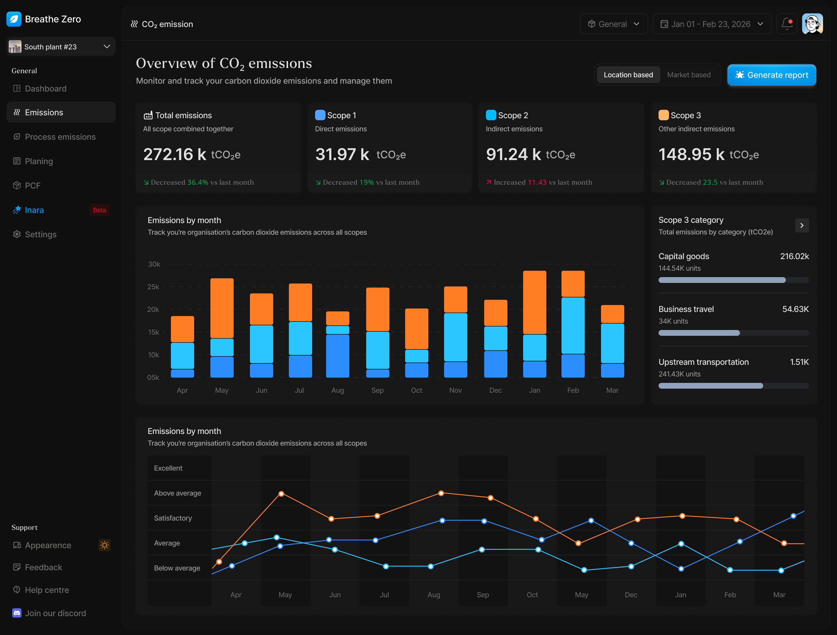

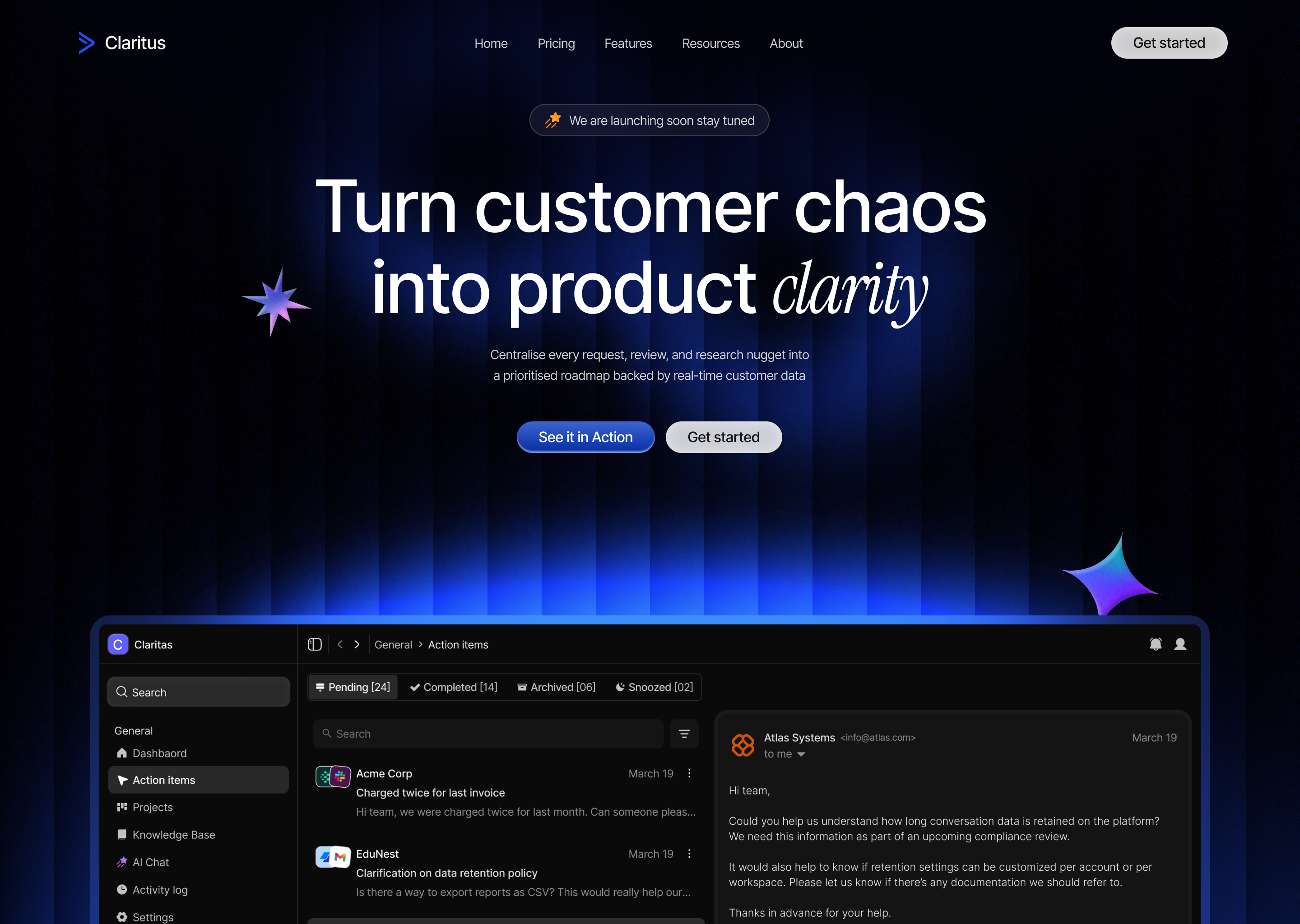
More coming soon
OUTCOME: LEAD QUALITY, PRICING POWER, TOP LINE GROWTH
Breathe ESG's biggest drop-off wasn't at signup, it was before it. Visitors would land on the site, read about GHG calculations and gap analysis, and leave without ever touching the product. ESG software has a long, trust-heavy sales cycle, and nobody converts off a features page alone. So the brief for me wasn't "get more signups." It was "give people a reason to sign up in the first place."
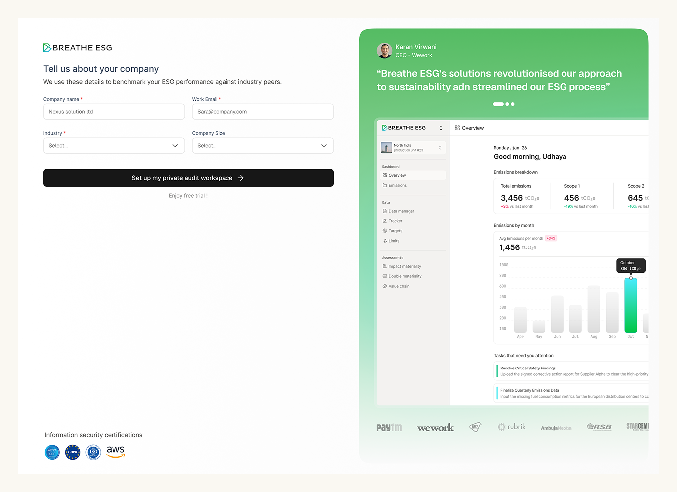
Clicking "Try our AI" takes visitors straight to a short signup screen: name, company, email, and industry. That's it. It's positioned as the last step before using something free, not as a purchase decision, so the friction is minimal even though we're asking for real information upfront. Once that's filled in, they're straight into the tool with their free credits, no waiting, no sales call in between.
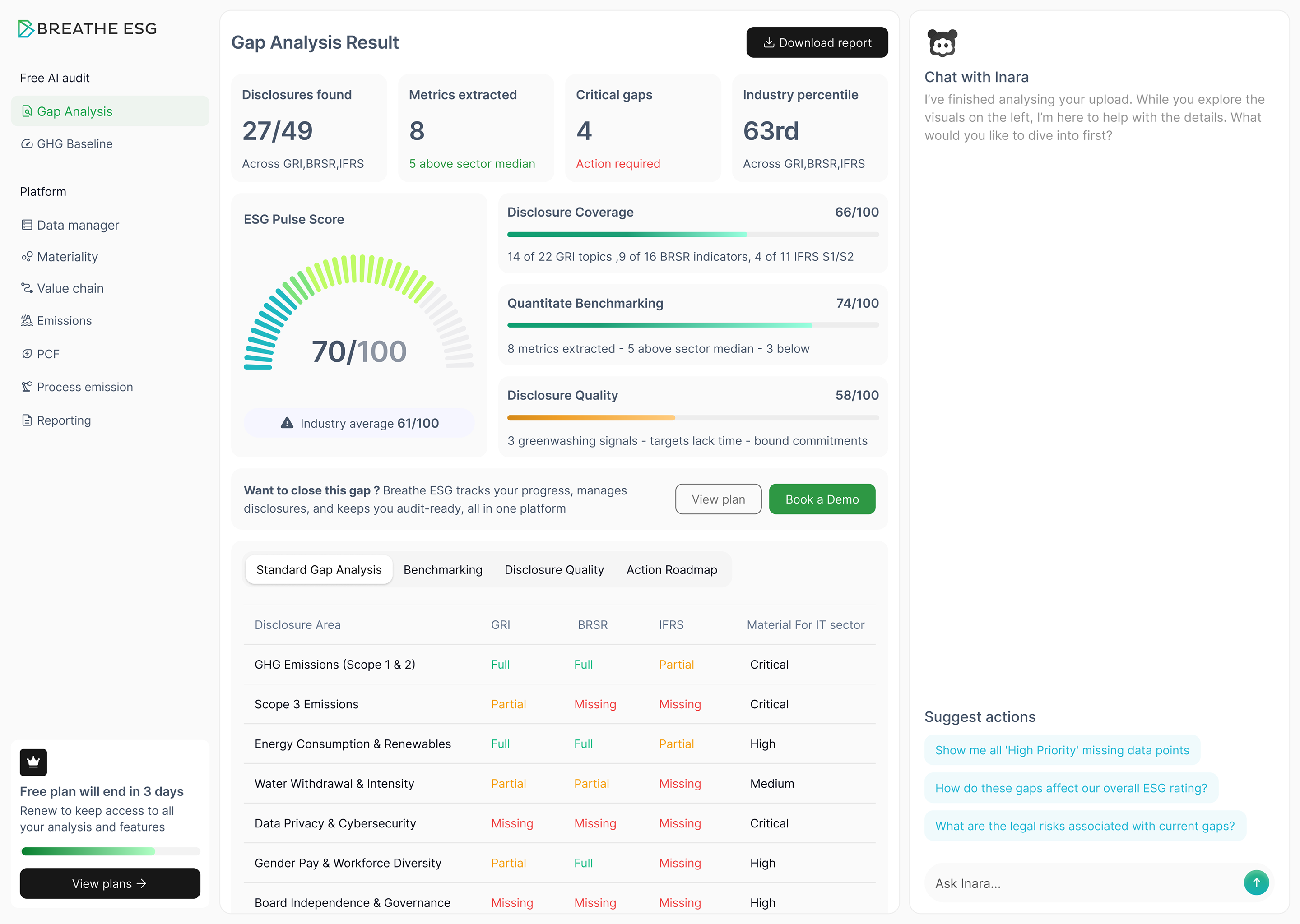
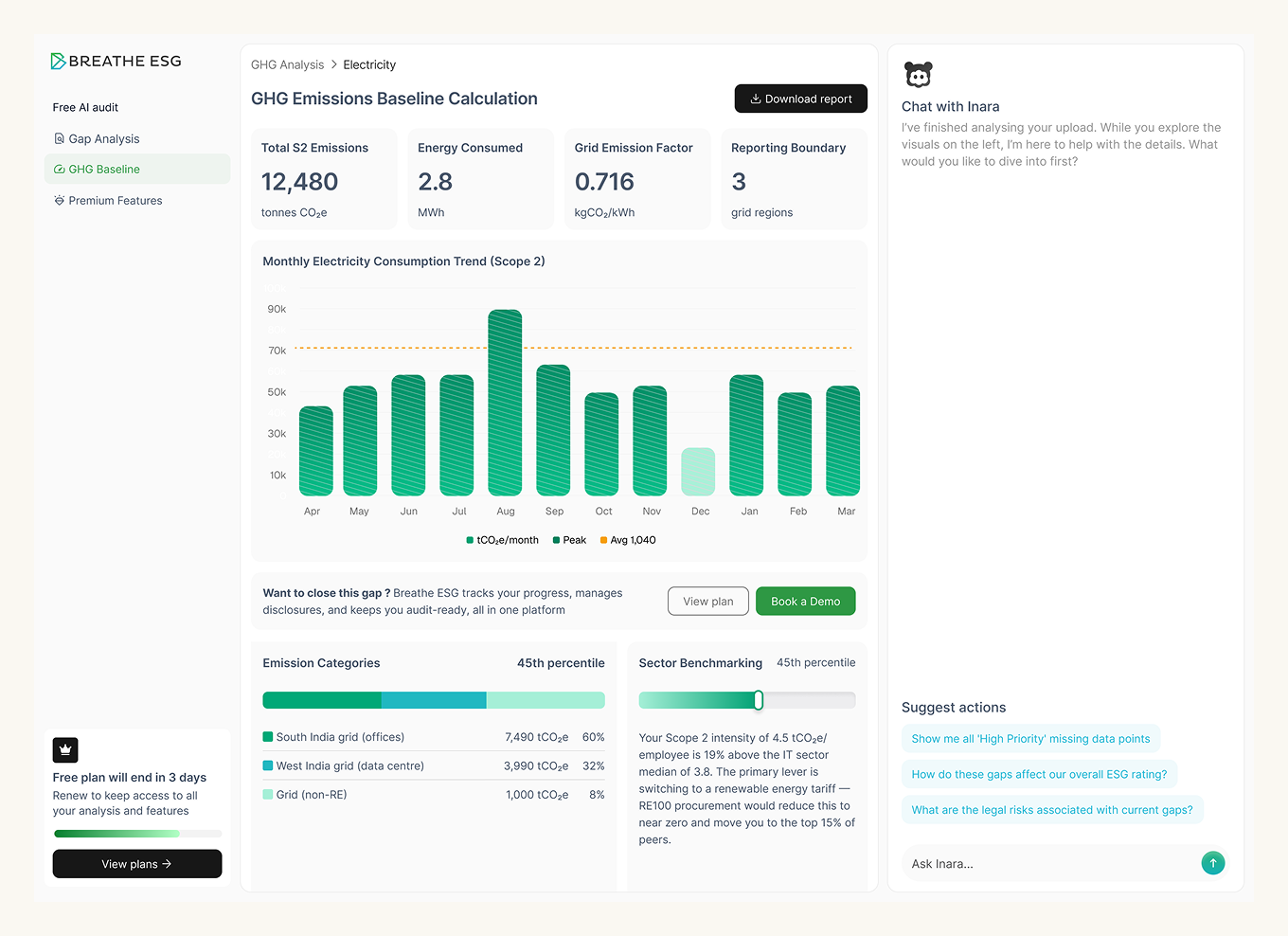
Once inside, the assistant runs actual gap analysis against reporting frameworks and can take a company's raw emissions data and calculate real numbers. It's not a scripted demo. The credit limit exists to keep it free to try, not to water down what it does, because the whole point of asking for details upfront was that the experience afterward had to be worth it.
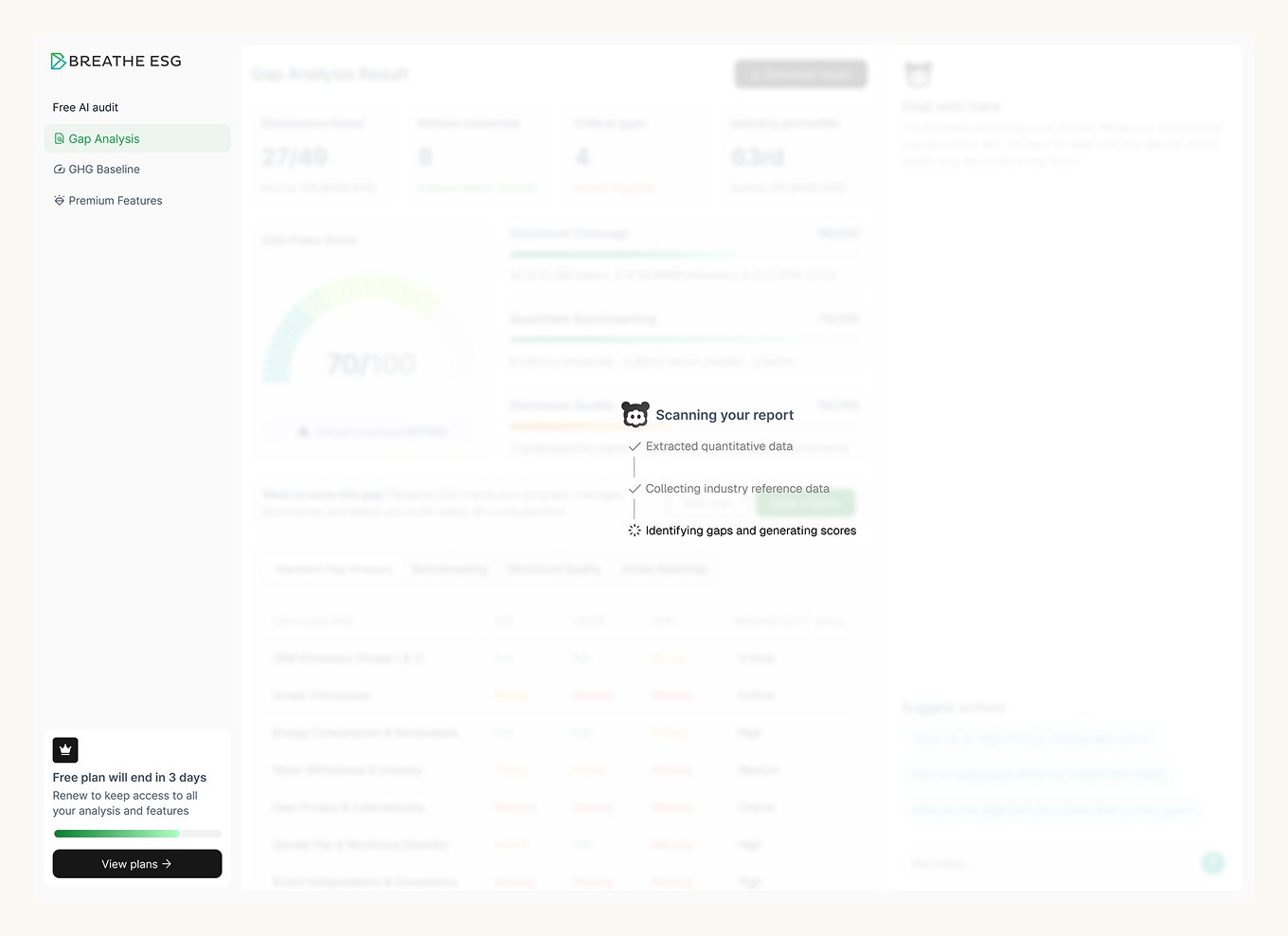
Because the details are collected before anyone touches the AI, every completed signup is a lead the moment it lands, whether or not that visitor ever converts to paid. Sales gets a name, a company, an industry, and a way to reach out, without waiting for a demo request or a "book a call" click. It turns a simple free trial gate into a steady stream of qualified contacts on its own.
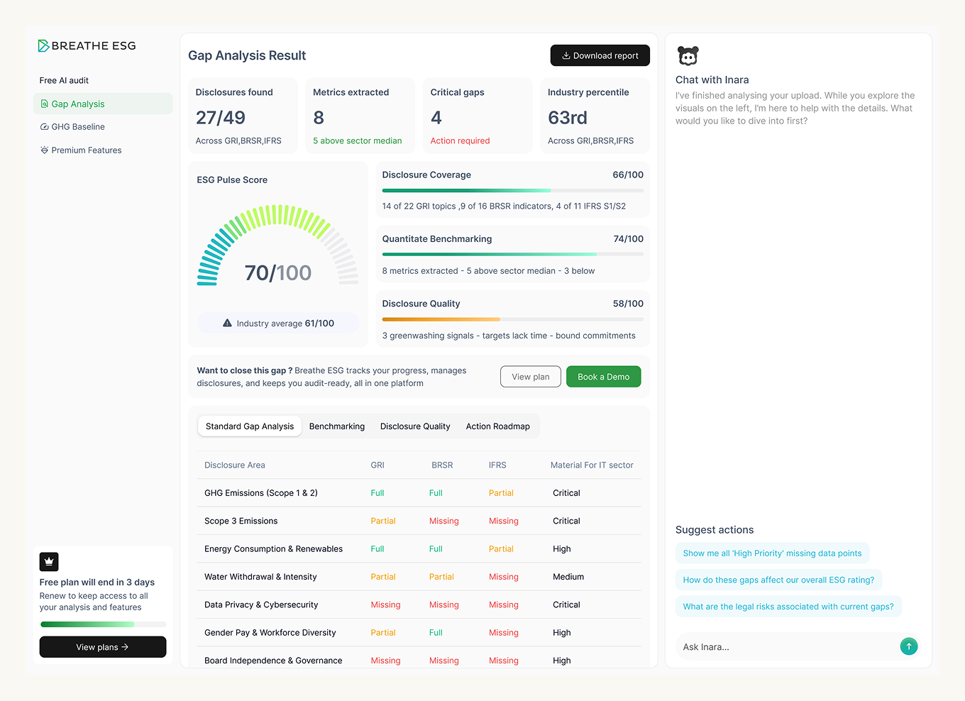
The people who go on to upgrade are the ones who ran their actual numbers through the free tool and got something useful back. By the time credits run out, they're not deciding whether the product works, they already know. The upgrade prompt just has to show up at the right moment, right as they're mid-analysis and want to keep going.
Since launch, free-tool visitors have converted to qualified demo requests at nearly 3x the rate of untouched site traffic, and a meaningful share convert directly to paid seats without a sales call at all.
Website link: breatheesg.com
OUTCOME: MARKET DISTINCTION, BRAND CREDIBILITY, TOP LINE GROWTH
Breathe ESG's identity hadn't caught up with what the company had actually become. The old site read like every other ESG SaaS tool, clean, generic, forgettable. And the newer AI-branded competitors all leaned on the same look: glowing orbs, gradient blur, a chatbot bubble. That look says "we bolted AI onto our product." It's the opposite of what actually makes Breathe ESG's model work. The AI is only as good as the client's own granular data sitting underneath it, so there's nothing generic about the output. I needed the brand to make that argument before a single word of copy did.
Green and blue for sustainability, purple for what sits on top of it. Color carries the same logic as the rest of the system. Green and blue anchor the brand in sustainability, familiar, credible, not trying too hard. Purple is reserved specifically for AI-touched moments, so it reads as a distinct layer sitting on top of the sustainability core rather than blending into it. The palette itself tells you which part of the product you're looking at.
Pixels as thread, thread as structure. The core visual system is built around a "data weaving" concept, individual pixels behaving like threads that pull together into structure, mirroring how raw, scattered client data gets organized into something coherent the model can actually reason over. It shows up as an animated motif across the site: fragments assembling into form on scroll, patterns that tighten as you move deeper into the product story. It's a literal picture of the pitch, disparate data, woven into intelligence.
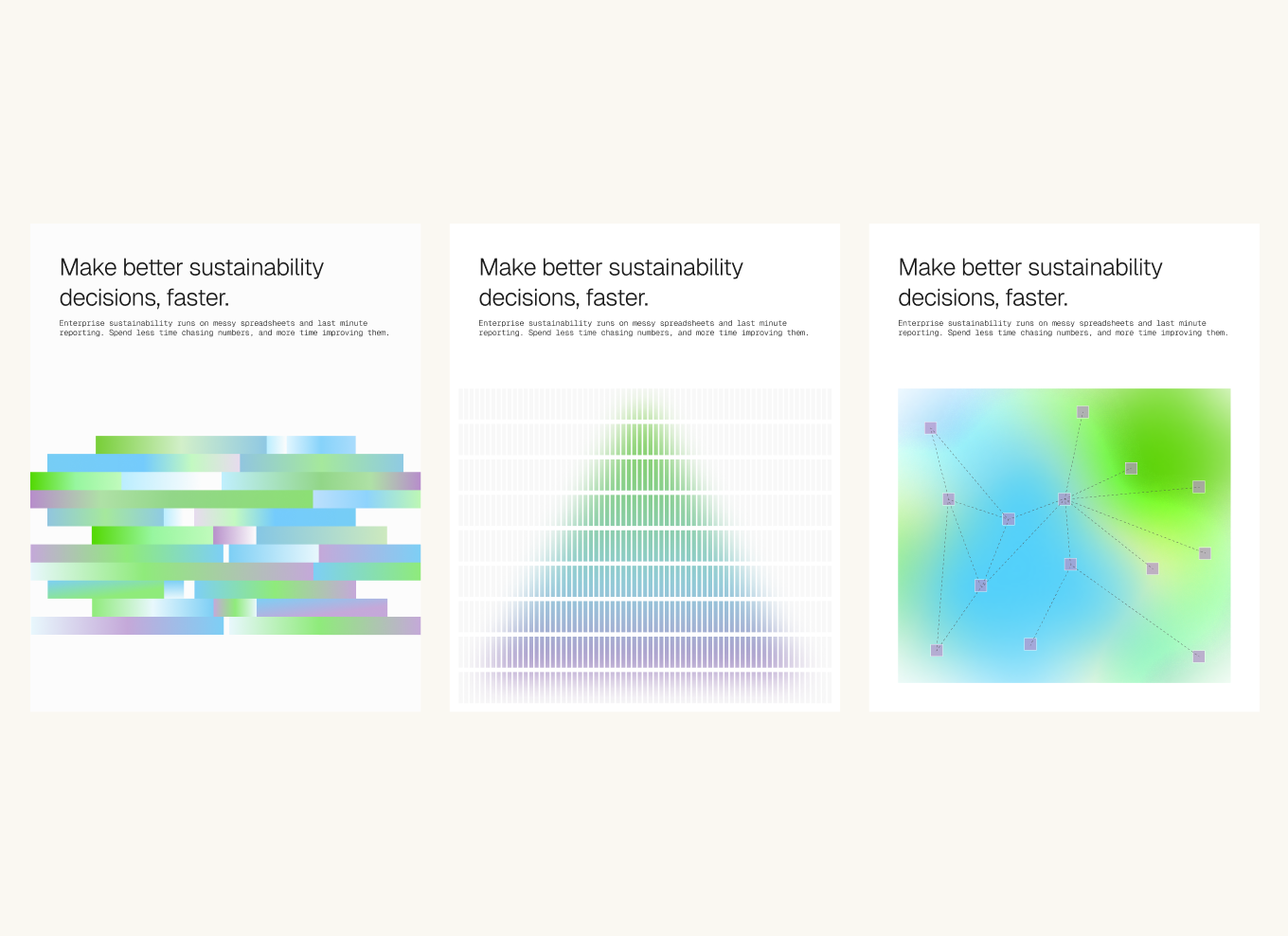
The identity had to argue a point, not just look nice. Every AI-branded product right now reaches for the same visual language, which means it's stopped meaning anything. That's a real problem for a company whose whole differentiator is the opposite of generic, the AI is only as good as the client's own data underneath it. So my brief to myself wasn't "look like an AI company," it was "make the data visible," so the AI reads as an output of real, specific information rather than a generic layer sitting on top of it.
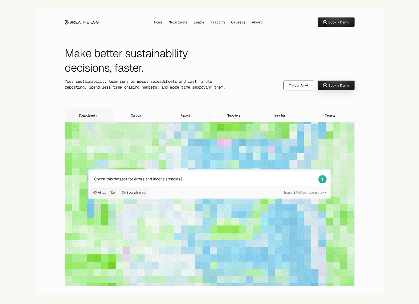
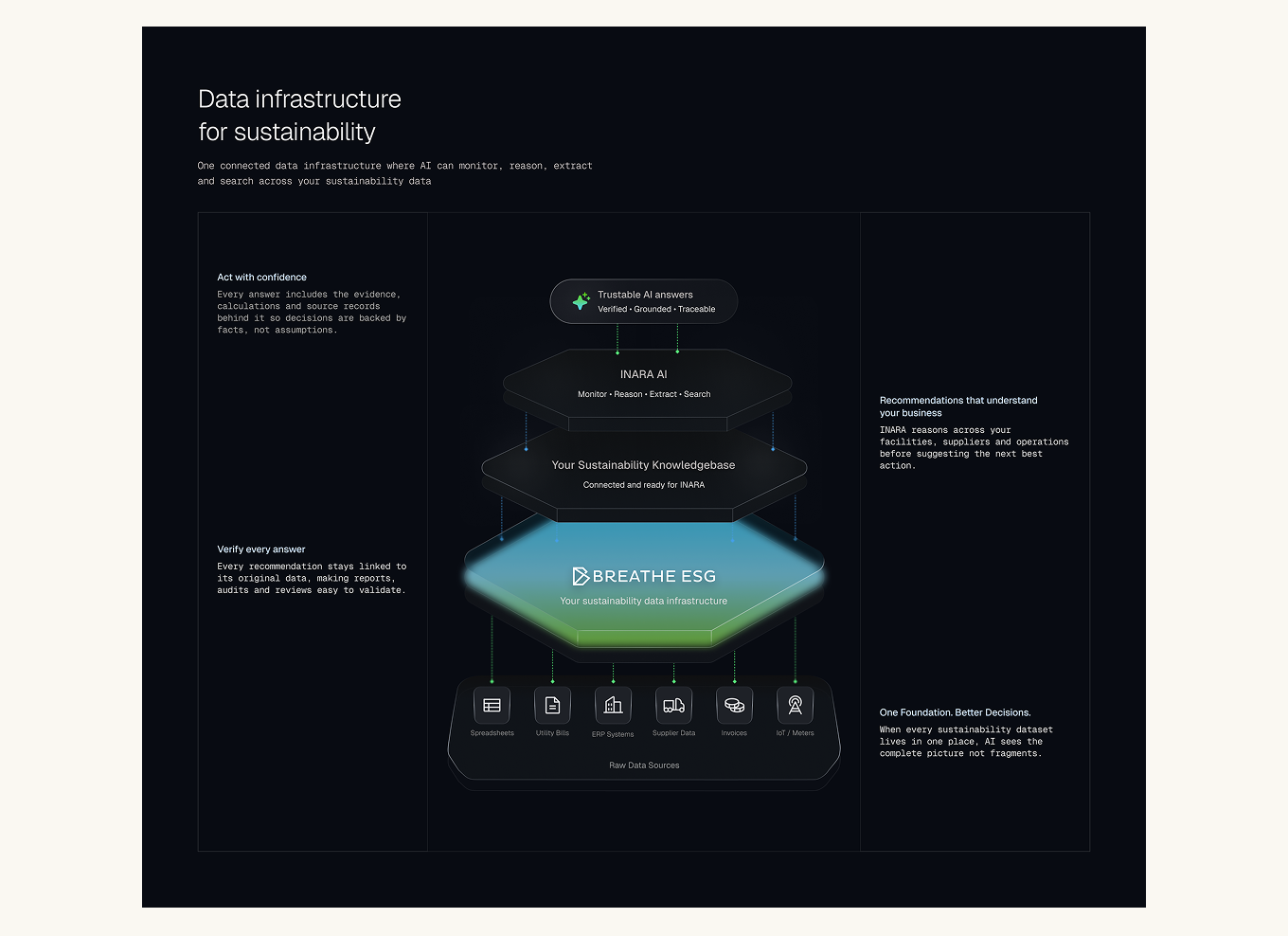
The distinction became the differentiator. Applied consistently across the entire site, typography, motion, iconography, and the weaving motif carried from the homepage through product pages, the identity stopped reading as "another AI tool" and started reading as a company built on its own infrastructure. That distinction is what mattered against bigger, louder AI-branded competitors. It's not a bolder look, it's a different claim.